Development of Chicken Wiggle started in February, 2016 with
a single image I created; an idea for a player package. The majority of Chicken Wiggle's production
was done by myself and Matthew Gambrell. Matthew did the programming,
music, and sound effects. I did the design, art, business, and marketing.
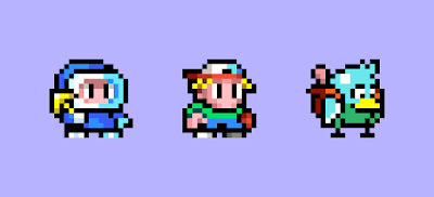
Please try to ignore the fact
that the little red dude is the hero from Xeodrifter. :)
At that early stage, I did not know what the main player(s) was going to look like so I grabbed the nearest sprite on hand.
At that early stage, I did not know what the main player(s) was going to look like so I grabbed the nearest sprite on hand.
The main emphasis with this player package was the balance
between the short jump/close attack range and the far range “hook shot” ability
that enabled the player to travel up/across relatively long distances. The two
extremes seemed to complement each other and rely on each other, which was a
pleasing concept. Later, we decided to use the “hook shot” to stun enemies – making
the close-range attack less scary to use – which really cemented the synergy
between the player’s different abilities.
The core gameplay idea was originally something that
could be described as a 2D Pushmo; played from a side view perspective. Draw
simple images with a handful of colors to create a level, and then navigate
through the level by jumping/destroying tiles of the level to reach a goal.
Looking at what Chicken Wiggle ended up being, we might have gone a little
further with the design and complexity of the game. Maybe a lot further.
But, before I get ahead of myself I should chat about how
we decided on a chicken and a worm as the stars of the game. As shown above, with
the initial player package, we started with a compact character that was the
same unit size as the level tiles they interact with. This immediately puts a
framework in place in terms of size and proportions. He’s basically square!
I kicked around a few different ideas for what the player
could be, in terms of a theme that could work across the whole game. Some of
the early candidates included a cute mountain climber with grappling hook, a
kid with a yo-yo, and a bird with a worm in his backpack. None of them are
technically right or wrong, better or worse. It really came down to personal
preference and what we thought was fun to embrace.
The cuteness and absurdity of a bird and worm combo was
too funny to resist. I experimented with many color variations to make it not
look too similar to the many bird characters out there, such as those found in
a certain game about birds that are angry. This led me down the path of
considering a chicken instead of a “regular” bird, which immediately adds an
additional level of fun and absurdity.
Initially, I adopted a similar 8-bit-ish style to Mutant
Mudds, with a black outline and very few colors. This worked fine, but I
further experimented with a more shaded 16-bit SNES style with colored outlines
and more colors for highlights and shadows. I was much happier with this look.
You’ll also notice that the worm got a lot bigger than the original bird/worm
design. This was to ensure he could have visible eyes, which immediately makes
him more interesting and identifiable than without – ignoring the fact that
this chicken is either super tiny or has a GIANT worm in his backpack. Chicken
Wiggle was born!
Wanting the game to be something really special, we let
our imaginations go wild. Designing the gameplay for Chicken Wiggle was very
different than designing Mutant Mudds or Xeodrifter. With Chicken Wiggle, we first
had to create the level editor that the user would ultimately use in the final
game before we could design any levels for the game. This was difficult,
frustrating, and a little maddening. But, it had to be this way. I wanted to
make sure the level editor was awesome, and what better way than forcing myself
to use it to make the levels for the game itself?
Making a level editor is basically like making an
application, like a paint program or a sophisticated word processor. You must think
about the layout, content, interactivity of each element, and much more. It’s
complex, so it takes deep forethought, some trial and error, and a lot of time
to carefully build it one brick at a time. All the while, I would try to make rudimentary
levels, but I had to accept they would never represent the final levels because
I didn’t truly know what the final level editor product would look like until
it was finished.
It took a lot of discipline and patience to wait until
all of the 100+ ingredients that are at the user’s disposal were all designed, implemented, and working properly before making level 1-1. I made countless experimental
levels to ensure the level editor was functioning as desired, while also
exploring level design approaches. I didn’t know how I wanted to present the “game”
aspect to the player, so it was a good opportunity to make lots of different
styles of level designs to find the right one.
Should a single level focus on a single item that is
available in the level editor, and fully explore all the ways of using that
item as a way of teaching the player how the ingredients can be used? Or
perhaps each level can contain any number of the ingredients, and the focus
should simply be on fun!? In the end, I went with something that explores a small
handful of items in a single level to show them on their own as well as how
they can work with other items – all while considering a gradual difficulty
curve from the beginning of the game to the end.
I have always enjoyed playing and analyzing Nintendo’s
work, and especially Mario games. Super Mario World was a big inspiration for
Mutant Mudds level design. But, with Chicken Wiggle I had a much larger pool of
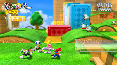
ingredients to play with! This led me to look at New Super Mario Brothers,
Mario Galaxy and the newer Super Mario 3D Land/World titles. In addition to
playing the games, I also watched a lot of gameplay videos on YouTube, which is
great when you just want to analyze the content of something instead of how it
feels. This led me to Mark Brown’s “Game Maker’s Toolkit” video
series.
One particular video resonated with me in a major way and
helped me cement my thoughts. It is called “Super Mario 3D World’s 4 Step Level
Design" (included above).
In the video, Mark dissects how the level design of 3D Mario games have
progressed over the years, and culminate into a very concrete system with the
release of Super Mario 3D World for the Wii U. As with most things that inspire
me creatively, I try to understand the core principles of what the source is achieving
and then I see how that may apply to the unique needs of what I want to accomplish
in my game.
In this case, I created a seven-step level design guide to
follow:
Step 1: Introduce new device in safe environment.
Step 2: Repeat device without safety net.
Step 3: Introduce new hazard.
Step 4: Repeat device with new variation and safety net.
Checkpoint
Step 5: Repeat hazard with extra challenge.
Step 6: Combination of device and hazard without safety
net.
Step 7: Repeat device with safety net to reach goal.
The level above is the first level in Chicken Wiggle, after the playable intro level. Let's go through the steps! Step 1 introduces the spring device in a safe environment where it is impossible to be hurt. I also include a ring that can be grappled up to, reminding the player of the grapple ability established in the intro level. Step 2 repeats the same device while introducing death below. This ensures the player understands how to interact with the device before continuing in the level. Step 3 introduces a new hazard in the form of a stationary bat. I also included the destructible pink block (first introduced in the intro level, prior) to remind the player they can peck to destroy things. Step 4 repeats the device with a variation in a safe environment. Familiarity with a twist. Check point! Step 5 repeats the hazard with a variation. In this case it is the simplest of variations. The player is required to jump and grapple-stun and/or attack. This is to ensure the player knows this is possible and potentially expected in the future. Step 6 combines the device and hazard with death below! This allows the player to put all of what they have learned into practice in a hazardous situation. Exciting! Step 7 is a calm reward for making it to the end; the same device with another slight twist to present something familiar with something slightly new.
As you can see, this level design approach generally relies on the use of two items. One “device”, and one “hazard”. In this example the device is a spring, which makes the player bounce higher, and the hazard is a static enemy that hurts the player if collided with. Really basic stuff. Then, there can be supporting items that facilitate the level, such as solid blocks (ground, walls, and ceiling), death spikes, wind currents, and jump-through platforms, and so on, which can all help create a level flow that is interesting, varied, and/or dangerous.
As you can see, this level design approach generally relies on the use of two items. One “device”, and one “hazard”. In this example the device is a spring, which makes the player bounce higher, and the hazard is a static enemy that hurts the player if collided with. Really basic stuff. Then, there can be supporting items that facilitate the level, such as solid blocks (ground, walls, and ceiling), death spikes, wind currents, and jump-through platforms, and so on, which can all help create a level flow that is interesting, varied, and/or dangerous.
And then there are the pick-ups, which can provide an
addition goal and sense of accomplishment in the form of 100 gems to collect in
a level and three bonus FUN letters – some of which are perhaps hidden away
slightly off the main path for a sense of mystery and discovery.
Hopefully, you can see that we start to have a decent set
of ingredients to play with as a designer. But, we now need figure out what to
use where and why, and with what? In order to accomplish this, I listed all of
the devices in a column and then in the neighboring column I tried to match
them up with what could be interesting hazards. Something like this:
Springers Blubats
Springers Eyehoppers
Balloons Thorny
Vines
Balloons Spike-a-boos
And so on…
Once I had a long list of every combination that I
thought were decent in concept, I graded each combination with what seemed to
be a suitable level of difficulty, from 1 to 5. 1 being easy, and 5 being
difficult. Throw into this mix the need for ghost themed levels and levels that
utilize power-ups, the list of possibilities quickly became quite huge.
I set myself the arbitrary goal of eight worlds with six
levels in each – totaling 48 levels. That seemed like a reasonable number of
levels for the story mode, knowing that I intended to upload “Official Atooi”
levels after launch for players to download at no extra cost.
The final level list is below. It may have changed
slightly once everything was in place, but this represents a fair idea of what
I felt was a good way to present the ingredients of the level editor to the
player in an informative and entertaining way. I don't think it's much of a spoiler, but if you would prefer not to even get a whiff of what may be in the levels you should skip over the table.
Cloud
Tower
|
|||
1-1
|
Springers
|
Blubats
|
2
|
1-2
|
Hero Mask!
|
Windies
|
3
|
1-3
|
Touchables
|
Eyehoppers
|
2
|
1-4
|
Invisibles
|
Vert.
Flyers
|
3
|
1-5
|
Peckables
|
Blubats
|
2
|
1-6
|
Cloud
Reprise
|
All
|
2
|
Treetop Tower
|
|||
2-1
|
Balloons
|
Thorny
Vines
|
3
|
2-2
|
Speed Shoes!
|
Spike-a-boos
|
3 or 4
|
2-3
|
Jumpers
|
Flame
Heads
|
3
|
2-4
|
Secret
Walls
|
Spin-a-spikes
|
3 or 4
|
2-5
|
Cloudaways
|
Slyders
|
3
|
2-6
|
Forest
Reprise
|
All
|
3 or 4
|
Dusty
Old Tower
|
|||
3-1
|
Balloons
|
Tough
Eyehoppers
|
3
|
3-2
|
Demo Hat!
|
Catbats
|
4
|
3-3
|
Jumpers
|
Slyders
|
3
|
3-4
|
Invisibles
|
Goblins
|
3 or 4
|
3-5
|
Touchables
|
Spin-a-Spikes
|
3
|
3-6
|
Dusty
Reprise
|
All
|
3 or 4
|
Tubular
Tower
|
|||
4-1
|
Peckables
|
Mr.
Bones
|
3
|
4-2
|
Jetpack!
|
Flame
Heads
|
3
|
4-3
|
Cloudaways
|
Prank
Imps
|
4
|
4-4
|
Ghost Touch!
|
Hori.
Helmets
|
4
|
4-5
|
Peckables
|
Green
Gobs
|
4
|
4-6
|
Tubular
Reprise
|
All
|
3 or 4
|
Slumber
Tower
|
|||
5-1
|
Balloons
|
Spike-a-boos
|
4
|
5-2
|
All The Power
|
4
|
|
5-3
|
Accord-a-likes
|
Prank
Imp
|
4
|
5-4
|
Secret
Walls
|
Mr.
Bones
|
4 or 5
|
5-5
|
Jelly
Jelly
|
Thorny
Vines
|
4
|
5-6
|
Reprise
5
|
All
|
4
|
Temple
Tower
|
|||
6-1
|
Rollabouts
|
Tough
Eyehoppers
|
4
|
6-2
|
Hero Mask!
|
Spin-a-spikes
|
4
|
6-3
|
Springers
|
Eyehoppers
|
4
|
6-4
|
Invisible
|
Growers
|
3 or 4
|
6-5
|
Switcharounds
|
Cannon-ons
|
4
|
6-6
|
Reprise
6
|
All
|
4
|
Under
Construction
|
|||
7-1
|
Jelly
Jelly
|
Eyehoppers
|
4
|
7-2
|
Jetpack!
|
Tough
Green Gobs
|
5
|
7-3
|
Balloon
|
Catbats
|
4
|
7-4
|
Secret
Walls
|
Reactors
|
5
|
7-5
|
Switcharounds
|
Tough
Eyehoppers
|
4
|
7-6
|
Reprise
7
|
All
|
5
|
Tours
De Dessert
|
|||
8-1
|
Touchables
|
Slyders
|
5
|
8-2
|
Demo Hat!
|
Prank
Imps
|
5
|
8-3
|
Rollabouts
|
Spin-a-spikes
|
5
|
8-4
|
Invisible
|
Vert.
Helmets
|
5
|
8-5
|
Jelly
Jelly
|
Tough
Green Gobs
|
5
|
8-6
|
Reprise
8
|
All
|
5
|
The really exciting thing for me was that the story mode all focused around the “Rescue Friend” gameplay rules in the level editor. This fit with the story presented at the beginning of the game. However, there are five other gameplay rules to choose from: Grab the Loot, Remove Meanies, Lock & Key, Take Me Home, and Destroy Blocks. These are rules I will be exploring with the Official Atooi levels that will be available for players to download.
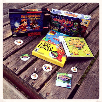
In the end, Chicken Wiggle drew on a collection of different
games for inspiration. Super Mario Maker for the whole level creation aspect,
Banjo-Kazooie for the duo and backpack and classic story vibe, New Zealand Story for some art and
level design styles, and The Magical Quest Starring Mickey Mouse for art style
and some music style. I’m sure there are many other sources of inspiration for
the game, but these stand out in my mind.
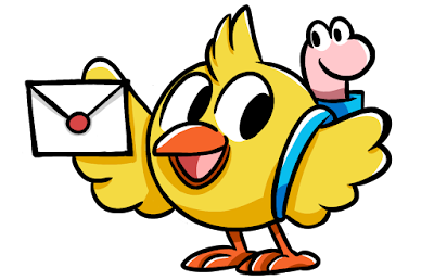
Illustration by @anniemae04
Illustration by @anniemae04
We finished the development of Chicken Wiggle and
submitted the game to Nintendo for lotcheck approval on June 9, 2017 – 16 months
after we started. After two failed attempts and some fixes later, Chicken
Wiggle was approved on August 2, 2017. The game could have been released on
August 10, 2017 in North America, but with the additional time and complexities
involved in a European launch due to the number of countries, the earliest
simultaneous release possible was August 17, 2017.
Thanks for reading, and happy gaming!
Thanks for reading, and happy gaming!


